V.G. Steel - 企業 形象與公司名片設計 - 羅傑企劃工房
V.G. Steel 企業 主要的營業項目為 特殊扁線 / 扁鐵 / 白鐵異型線,LOGO的設計以 V G 二字合而為一字,並將其立體化並加上髮絲感以表現其線材之屬性,色系即為原材質之原色~銀灰...下方 V G Steel 字形則具有利落的現代感...
營業項目,扁線,不鏽鋼線,企業
15243
portfolio_page-template-default,single,single-portfolio_page,postid-15243,theme-bridge,bridge-core-3.1.7,qi-blocks-1.2.7,qodef-gutenberg--no-touch,qode-listing-3.0.7,qode-social-login-2.0.3,qode-quick-links-2.1,qode-restaurant-3.0.3,woocommerce-no-js,qodef-qi--no-touch,qi-addons-for-elementor-1.6.9,qode-wishlist-for-woocommerce-1.0.4,qwfw--no-touch,qode-page-transition-enabled,ajax_fade,page_not_loaded,, vertical_menu_transparency vertical_menu_transparency_on,vss_responsive_adv,vss_width_768,qode-content-sidebar-responsive,columns-4,qode-child-theme-ver-,qode-theme-ver-30.4.2,qode-theme-bridge,qode_header_in_grid,qode-portfolio-single-template-1,wpb-js-composer js-comp-ver-7.6,vc_responsive,elementor-default,elementor-kit-20439

V.G. Steel 形象設計

V.G. Steel 企業 形象與公司名片設計
公司 / 品牌

V.G. Steel

Category
企業
About This Project

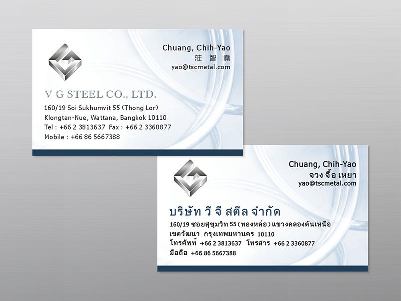
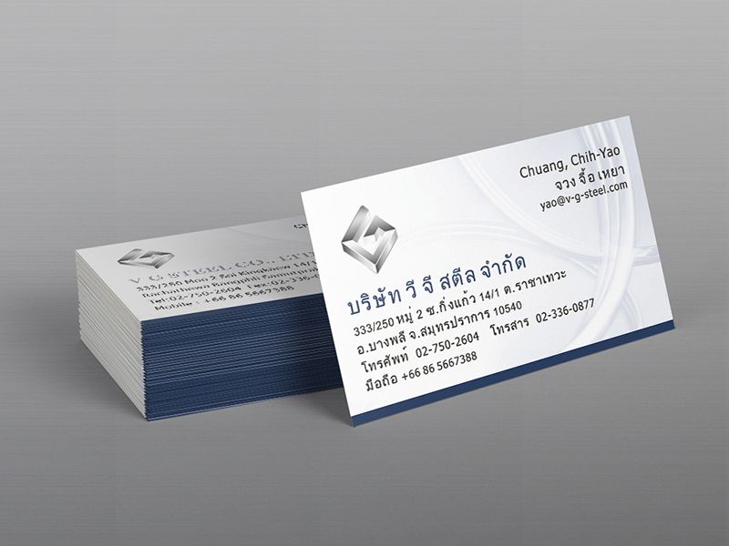
V.G. Steel 企業 主要的營業項目為
特殊扁線 / 扁鐵 / 白鐵異型線
LOGO的設計以 V G 二字合而為一字
並將其立體化並加上髮絲感以表現其線材之屬性
色系即為原材質之原色~銀灰
下方 V G Steel 字形則具有利落的現代感
成品主要的銷售地區為泰國
因此,名片的正反面分別為英文、泰文版
版面設計一樣簡單俐落
漠藍色系搭配線材圈繞之背景

No Comments

Post A Comment