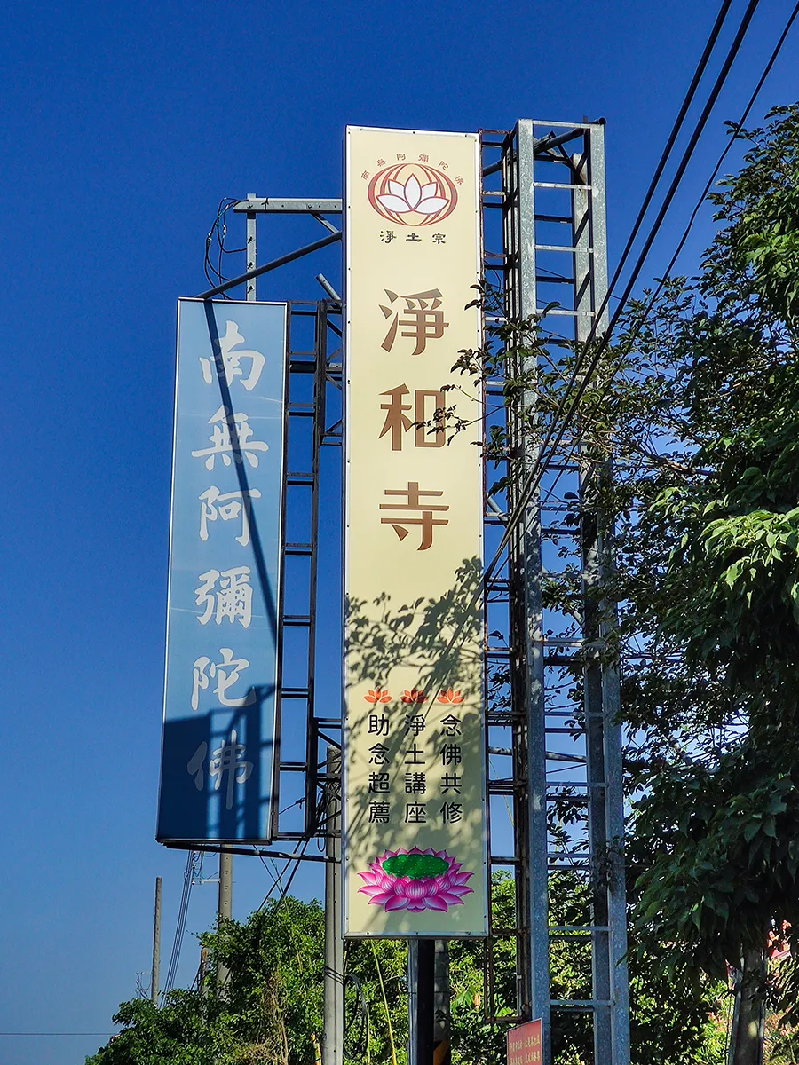
關廟淨和寺 招牌 |工作手札| 羅傑企劃工房
23200
wp-singular,roger_note-template-default,single,single-roger_note,postid-23200,wp-theme-bridge,wp-child-theme-bridge-child-theme,theme-bridge,bridge-core-3.3.5.1,qi-blocks-1.5.4,qodef-gutenberg--no-touch,qode-quick-links-2.1.1.2,qode-restaurant-3.0.5.1,roger-notes-page,woocommerce-no-js,qode-optimizer-1.2.3,qode-wishlist-for-woocommerce-1.2.9,qwfw--no-touch,qode-page-transition-enabled,ajax_fade,page_not_loaded,, vertical_menu_transparency vertical_menu_transparency_on,vss_responsive_adv,vss_width_768,qode-content-sidebar-responsive,qode-smooth-scroll-enabled,columns-4,qode-child-theme-ver-,qode-theme-ver-30.9.1,qode-theme-bridge,qode_header_in_grid,wpb-js-composer js-comp-ver-9.0.1,vc_responsive

← 回到 Notes

Roger Design

關廟淨和寺 招牌

關廟淨和寺
關廟淨和寺 招牌,原燈箱版面因西晒褪色,以原鐵架更換面板,雖然在招牌安裝後樹枝、樹蔭遮蔽的問題會適度修剪,但設計時仍將宗徽與寺名排版在遠處可視處,下方列出念佛共修、淨土講座、助念超薦等共修內容。
招牌米色為底,淨和寺三字選擇較樸拙的字型、茶色,給人、緩慢、恬靜、祥和的感受。
留言 0
暫時沒有評論

發表評論